Distilling the Gothic: An interview with Jiaying Zhang.
Set designer Jiaying Zhang on the single white wall behind Heartbeat Opera’s Vanessa, and designing through abstraction and distillation.

Set designer Jiaying Zhang on the single white wall behind Heartbeat Opera’s Vanessa, and designing through abstraction and distillation.

Scenic designer and educator at UC Riverside whose work spans theatre and television, rooted in storytelling, immersive worlds, and the audience.

Scenic designer Jack Golden reflects on collaboration, instinct, and making strange and meaningful theatre through design and teaching.

Ruth Robles is a Mexican singer and vocal director whose work moves between performance and creation, and always toward emotional truth.

Josué Cerón is a Mexican opera singer whose career spans the stages of Mexico and Italy, rooted in discipline, preparation, and artistic generosity.
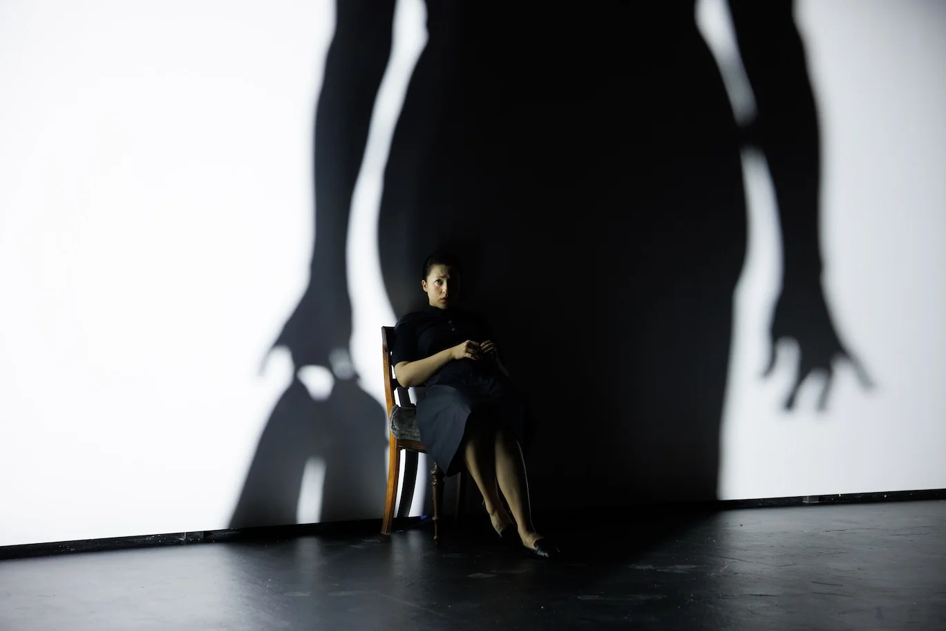
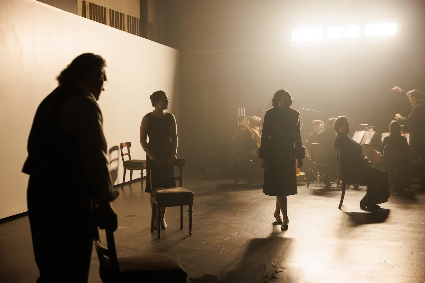
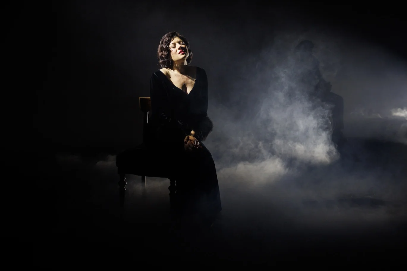
When Heartbeat Opera co-developed Samuel Barber and Gian Carlo Menotti’s Vanessa with the Williamstown Theatre Festival, they bypassed the grand, literal staging traditionally used to frame the 1958 opera. For this New York City run at the Baruch Performing Arts Center, the production brought the gothic psychodrama into a microscopic focus. Guided by director R.B. Schlather’s approach to visceral, up-close storytelling, the performance was condensed to five singers and a seven-piece chamber ensemble, eliminating the historical domestic clutter to let the opera’s raw emotional undercurrents take over.The visual boundary for this staging is a single, massive, angled white wall designed by Jiaying Zhang. Evolving from an original design concept by Schlather, Zhang’s set acts less like a physical space and more like a fluid canvas for light, silhouette, and movement.
In this conversation, Zhang breaks down how she negotiated this minimalist environment across two different venues, and how her process of visual distillation shifts when transitioning between the cool abstraction of Vanessa and the eccentric, mutable worlds of her other recent projects.
Below is the full interview between Milan Schell with set designer Jiaying Zhang at the Baruch Performing Arts Center in New York City.
Jiaying Zhang. It’s not wrong, as far as it goes. When director R.B. Schlather, who also designed the original Williamstown Theatre Festival production, first proposed it, the idea came from an image that responded to the story: Vanessa’s shadow swallowing Erika. That relationship became our starting point.
What drew us to the white wall was precisely its abstraction. It doesn’t declare itself. It waits. And that quality felt true to these characters – people living inside a kind of suspended time, carrying emotional weight that has no visible form. The whiteness could read as emptiness, as blank memory, indistinct future, winter, innocence, or as an attitude. Different audiences would land in different places with it.
When I first read the story, what struck me was its sense of the eternal – the feeling that these people have been waiting forever and might go on waiting. That made me think of them as ghosts, transparent, weightless, drifting through a house that holds them but offers no warmth. The shadow play became a way to physicalize that: figures overlapping, bleeding into one another, sometimes stormy and atmospheric – which also speaks to the gothic undercurrent running through the whole opera.
JZ. When we were auditioning the wall color, we were trying to find the most neutral white with high light reflectance value so that it has a pureness that doesn’t editorialize. That neutrality is what allows everything else to speak, and I would say the wall, the light, the shadows, the performers – they’re all in conversation.
Dramaturgically, this space feels liminal, like a pathway. The wall sets the conditions – it creates the possibility – and then the language of lighting becomes part of the poetic gesture that helps tell the story. There are moments when the lighting suggests a window frame, and at the same time a boundary, a box enclosing the character. There are also times when the color of lighting shifts from cold to warm white, as if ignited by desire. So the gestures are simple but strong, using a similar abstract language to evoke feelings across different planes of reality.
Because the set is so minimal, everything in front of it is thrown into relief, as if under the microscope, which amplifies every detail. The wall becomes a kind of counter-pressure: the quieter it is visually, the more room there is for the emotions, the performers, and the music to expand and flow.
JZ. When R.B. first pitched the design, it was partly about function – being able to throw a large shadow onto Erika – and partly about the symbolism of the white. We both had the same impulse that this story wanted an abstract world, not a realistic one. As this is a very saturated melodrama, realism would have domesticated it, made it manageable. And this story should stay unresolved. What makes it feel modern and alive is its timelessness, the cyclical quality of it – the characters’ delusions, their isolation, their longing, turning endlessly on themselves.
For the world premiere at Williamstown Theatre Festival, the venue was a space inside a strip mall that was still being renovated. Long and rectangular, low ceiling, large HVAC vents hanging down, all black. We decided the wall should stretch vertically to the pipe height to create a kind of compressed slice of the world. We wanted a really long wall to create the feeling of a corridor, a purgatory, a place you’re waiting or passing through but can’t leave. Eerie and stark. We also wanted to use the venue’s doors and voms as entrances and exits, and to create an exit behind the wall so characters could disappear from the world abruptly, mysteriously. That’s part of why the wall sits at an angle – it creates that possibility, but it also gives the space a slight wrongness, a world that’s just a little off. Subtle, but present. The angle also directs the gaze in a specific way, which creates an unsettled feeling. Of course, beyond the visual considerations, there were also practical ones such as sightlines and the flow of traffic on and off stage, which all shaped the final decisions.
Baruch Performing Arts Center is a venue with a completely different feeling. More square, much higher ceiling, and its own strong characteristics. It has very present railings at the balcony, beige concrete walls with acoustic details, a black shop door sitting right at center upstage. We ultimately kept the wall at roughly the same length but brought the height down slightly, because going taller would have pulled focus away from the characters. We also added black masking on both sides of the stage to retain the voidness of the Williamstown production, and added more thickness to the wall to give it a more monolithic presence. The wall dimensions aren’t dramatically different between the two venues, but the feeling is. At Williamstown the space felt open, almost fluid, while at BPAC it felt more constrained and more trapped. Which, for this opera, isn’t necessarily a bad thing.

JZ. With this production, we wanted to tell the story through the lens of the characters’ emotions and their relationships, something raw and brutal. To do that, we stripped away anything decorative, anything that would explain or illustrate, and tried to let something more intuitive and subconscious emerge. In a way, that stripping back is also what makes the story more emotionally accessible. Musically it’s also a very intense opera, so it’s another reason we wanted to push the visual language in the same direction.
This does reflect how I approach design more broadly. While the research stage can be extensive, it’s always a process of distillation, a journey to find the “truth” of the story. I tend to think the text is the foundation, and everything else should serve it rather than decorate it.
That said, every production is different. There are stories that might call for realism or naturalism. Ultimately, the magic of theatre lies in its capacity for transformation – whether the aesthetic is naturalistic or abstract, the objective remains the same: to construct a cohesive world and a resonant atmosphere that allows the characters to inhabit a space, and in turn, effectively convey the idea. I think it is always a matter of perspective and deliberate choice in how we frame the narrative.
JZ. One example is a production I designed at The Brick called A(U)NTS!, written by Zoë Geltman and directed by Julia Sirna-Frest. The story follows childless aunts working as receptionists in a dental office, drawing parallels to highly organized, female-led ant colonies. Over the course of the play, the boundary between the office world and the insect world begins to dissolve, and the aunts gradually transform into giant humanoid ants. It’s funny, surreal, and absurd.
With that one, I wanted to embrace both the mundaneness of the human-ant “glitch” and the realism of the office setting – so the design worked through contamination of the familiar. Things oscillated between realness and caricature: loose soil surrounding the desk, a latex office curtain that evoked the smell of a dentist’s gloves, a spray foam mount. And then there was an iridescent strip curtain that was the office backdrop but also through which the performers pushed their hands and arms, doing a kind of hand dance – the curtain acting as a membrane between the human world and the fantasy world. I wanted to create a world that felt mutable, like it could tip either way at any moment.
JZ. Actually I don’t think I consciously transition. Each project just resets me. I go back to the text, back to the research, and let the world speak for itself. I enjoy working across such different registers. It keeps me honest, in a way that I don’t rely on a certain aesthetic. And I get to use different muscles, different “feeling antennas”.
Milan Schell is a musician and interdisciplinary artist working across sound, technology, and visual media. Centered around his music project EIVIBLEIVI, his practice involves the development of custom instruments and systems for live performance, composition, and audiovisual installation, as well as the release of self-produced recordings.
His current research focuses on hybrid sound synthesis, combining digitally generated vibrations with acoustic resonance and transforming percussion instruments into loudspeakers that can be played both manually and electronically.
In addition, Milan works as a composer and sound designer for film, dance, and theater productions. He is based in New York.
Originally from Shanghai, China, Jiaying Zhang is a New York–based set designer whose work explores alternative storytelling forms and new ways to shape theatrical language. She is drawn to the energy of bodies in space, the sculpting of atmosphere, and the interweaving of visual and emotional worlds — an approach that is rigorously concept-driven and rooted in close collaboration with directors and texts.
Her design credits include Vanessa (Baruch Performing Arts Center), Working Girl (La Jolla Playhouse, co-designed with Christine Jones and Brett Banakis as the collective AMP), there’s no day or night in space (Soho Rep Lab), A(U)NTS! (The Brick), and Le Nozze di Figaro (The Juilliard School). Her associate design work spans Giulio Cesare (Hudson Hall), Eurydice (Boston Lyric Opera), Die Zauberflöte (Rice University), Vanessa (Williamstown Theatre Festival), and Dido and Aeneas and The Rape of Lucretia (Rice University).
Support artists—share this
Off-Book is the Skene newsletter for artists and makers. Profiles, opportunities, and editorials, free. New subscribers also receive the 2026 Performing Arts Survival Guide.
We use cookies to optimize our website and our service functionalities.